
Documentation Index

Fetch the complete documentation index at: https://cometchat-22654f5b-v5-calling-sdk-enhancement-react-native.mintlify.app/llms.txt

Use this file to discover all available pages before exploring further.

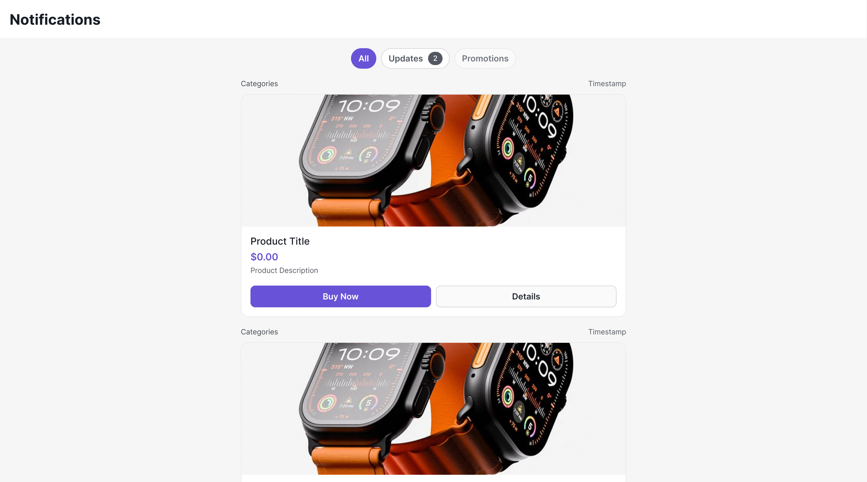
CometChat Campaigns enables you to send rich, interactive notifications to users through an in-app notification feed. Each notification is rendered as a native card using the CometChat Cards library — supporting images, text, buttons, layouts, and interactive actions.
Before proceeding, ensure you have completed the UI Kit integration and the Dashboard Setup for Campaigns.

Overview

Campaigns delivers notifications as Card Schema JSON — a structured format that defines the visual layout of each notification card. The system consists of three layers:
  1. CometChat Chat SDK — Fetches feed items, manages read/delivered state, provides real-time listeners, handles push notification tracking
  2. CometChat Cards Library (@cometchat/cards-react) — Renders Card Schema JSON into native DOM elements
  3. CometChat UI Kit — Provides the ready-to-use CometChatNotificationFeed component that wires everything together

Architecture Flow

Dashboard / API → Campaign Created → Push + WebSocket Delivery

                SDK: NotificationFeedRequestBuilder.fetchNext()

                NotificationFeedItem.getContent() → Card Schema JSON

                Cards Library: CometChatCardView

                Native Rendered Card (images, text, buttons, layouts)

                User clicks button → onAction callback → Your code handles it

How Cards Work

Each NotificationFeedItem from the SDK contains a content field — an object holding the Card Schema JSON. This JSON is passed directly to the CometChat Cards renderer which produces a DOM element. The Cards library is a pure renderer:
  • Input: Card Schema JSON string + theme mode + optional action callback
  • Output: Native DOM element hierarchy
It does not execute actions, manage message state, or call any SDK methods. When users click interactive elements (buttons, links), the library emits the action to your callback. You decide what happens — open a URL, navigate to a chat, make an API call, etc.

Card Schema JSON Example

{
  "version": "1.0",
  "body": [
    {
      "type": "column",
      "backgroundColor": {
        "light": "transparent",
        "dark": "transparent"
      },
      "gap": 5,
      "items": [
        {
          "type": "text",
          "content": "📢 Announcement",
          "variant": "heading2",
          "id": "txt_99323141-2459-4e33-88d3-ca39c5fd2f50"
        },
        {
          "type": "text",
          "content": "Your announcement message here.",
          "variant": "body",
          "id": "txt_61a417bc-5e4a-4ba2-bfe7-b7bc64dbaf35"
        },
        {
          "type": "divider",
          "id": "div_80f5c7fb-fd10-41d1-8c2f-51498f0f62d0"
        },
        {
          "type": "button",
          "label": "Learn More",
          "backgroundColor": {
            "light": "transparent",
            "dark": "transparent"
          },
          "textColor": {
            "light": "#6C5CE7",
            "dark": "#6C5CE7"
          },
          "size": 40,
          "fontSize": 13,
          "borderRadius": 6,
          "padding": {
            "top": 0,
            "right": 16,
            "bottom": 0,
            "left": 16
          },
          "action": {
            "type": "openUrl",
            "url": ""
          },
          "id": "btn_9b87a3f1-b0c6-45b9-a4c2-e22ea590f17f"
        }
      ],
      "id": "col_98fed9bd-1a95-4cee-aa81-84a9016e41f2"
    }
  ],
  "fallbackText": "",
  "style": {
    "background": {
      "light": "#E8E8E8",
      "dark": "#E8E8E8"
    },
    "borderRadius": 16,
    "borderColor": {
      "light": "#DFE6E9",
      "dark": "#DFE6E9"
    },
    "padding": 12
  }
}
The schema supports 20 element types (text, image, icon, avatar, badge, divider, spacer, chip, progressBar, codeBlock, markdown, row, column, grid, accordion, tabs, button, iconButton, link, table) and 9 action types (openUrl, chatWithUser, chatWithGroup, sendMessage, copyToClipboard, downloadFile, initiateCall, apiCall, customCallback).

How Cards Work in the UI Kit

The CometChatNotificationFeed component uses the CometChat Cards library internally to render each notification. Here’s what happens under the hood:
  1. The component fetches NotificationFeedItem objects from the SDK
  2. For each item, it extracts the content field (Card Schema JSON)
  3. It passes the JSON to CometChatCardView from @cometchat/cards-react
  4. The Cards renderer produces native UI — text, images, buttons, layouts — directly from the JSON
  5. When users click buttons/links inside a card, the action is emitted back to the component which handles navigation (open URL, navigate to chat, etc.)
You don’t need to interact with the Cards library directly when using CometChatNotificationFeed — it’s all wired up. But if you want to render cards outside the feed (e.g., a standalone card in a modal), you can use the Cards library directly. See the SDK Campaigns documentation for standalone usage.

Handling Push Notifications for Campaigns

When a campaign push notification arrives via Web Push or FCM, you should:
  1. Report delivery — Call CometChat.markPushNotificationDelivered() when the notification is received
  2. Report click — Call CometChat.markPushNotificationClicked() when the user clicks the notification
  3. Deep link — Use the announcement ID from the push payload to fetch the full item via CometChat.getNotificationFeedItem(id) and display it
import { CometChat } from "@cometchat/chat-sdk-javascript";

// When push notification is received (e.g., in service worker)
const pushNotification = new CometChat.PushNotification(pushPayloadData);
CometChat.markPushNotificationDelivered(pushNotification);

// When user clicks the notification
CometChat.markPushNotificationClicked(pushNotification);

// Navigate to feed or show specific item
const item = await CometChat.getNotificationFeedItem(pushNotification.getId());
See the SDK Campaigns documentation for the complete push notification tracking API.

Sending Campaigns

Before integrating the frontend, you need to set up channels, categories, templates, and campaigns in the CometChat Dashboard. Follow the Dashboard Setup Guide for step-by-step instructions with screenshots.

Using the UI Kit Component

The easiest way to add a notification feed to your app is the CometChatNotificationFeed component. It handles fetching, rendering, pagination, filtering, real-time updates, and engagement reporting out of the box.
import { CometChatNotificationFeed } from "@cometchat/chat-uikit-react";
import "@cometchat/chat-uikit-react/css-variables.css";

function NotificationsScreen() {
  return (
    <CometChatNotificationFeed
      onItemClick={(item) => {
        // Handle item click
      }}
      onBackPress={() => {
        // Navigate back
      }}
    />
  );
}
See the full CometChatNotificationFeed component documentation for all configuration options, styling, and customization.

Next Steps

SDK Campaigns API

Full API reference for feed items, categories, engagement, and push tracking

CometChatNotificationFeed

Ready-to-use component with filtering, real-time updates, and styling